
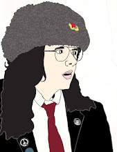
I have now chosen a Type Face called ‘Kremlin Minister Black 3D’ for my masthead. I have decided to repeat the title, in two colours. I chose to do this because I had to front cover images that are a little bit different, so I wanted the logo to reflect this too. Just under my masthead is the fictional website address of the magazine www.obey.com, I used the typeface ‘Kremlin Kommisar’ for the website text and the rest of the text on the cover apart from the word FREE which is in Arial Black. I chose to use a different typeface for the word FREE because I did not like the Capital E for the typeface ‘Kremlin Kommisar’ I found a bar code to use for the front cover which will be placed towards the bottom of the cover. I now have both my original photo and my illustration facing each other, as if they are in shock at seeing each other. For my cover lines have used a very similar style to that of the journal, and the items mentioned on the front will be featured on the contents pages.
I'm on the fence about this, while more customization is good, I have a feeling this is a "in-progress" update, it just feels incomplete and half-way there.
ReplyDeleteWe use badge layout for apps on design approvals (visual projects), so the image being displayed is important. Old layout "feels like" it had larger images,
maybe because the images were cropped more loosely so it's easier to tell which project it was at quick glance. Now the image is cropped closer, making it
harder to scan thru at quick glance. I find myself needing to click into the project more often than usual. Which makes the whole user experience less
efficient.
I have a couple suggestions that might make it work better:
1. Increase the height of the window the cover image is being displayed.
2. Let us to choose which image to be displayed as "cover" (like how Pinterest handles cover images of each board, was hoping for this for a long time)
3. Let us adjust which part of the image to show and how tight or loose the crop is (with a fixed window, let us move the image around and maybe enlarge or
shrink it to control what shows thru the window. Pinterest does a limited form of this, which is very useful in making the cover image relevant)
4. Allow Cover Image to be ordered in different hierarchy (currently every element can be ordered differently except the Cover Image, it seems to be stuck
in the 2nd spot, would like the option to set it on another spot in the layout. This one seems like an easy fix, since you guys allow that for every other
element already)